

CASE STUDY
Amazon Growth Case Studies
See how Lab 916 helps established brands add 6- and 7-figures in incremental Amazon revenue without burning their team out.
$250M+
GMV managed across all clients
Avg. +85%
YoY growth in first 12 months
50+
Brands across Food & Bev, Manufacturing, CPG
All Case Studies
Search….

Feb 5, 2023
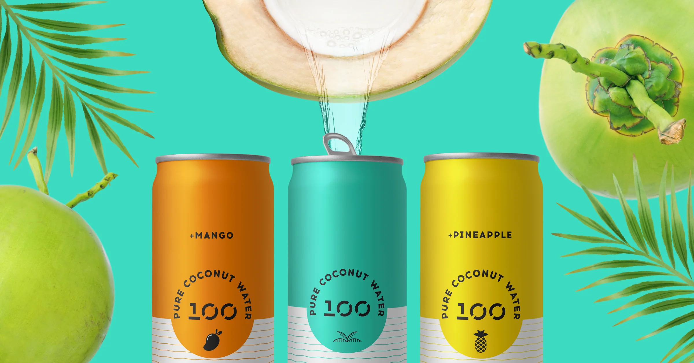
The award-winning Amazon case study

Jan 22, 2026
#1 on Amazon against Dove & Olay

Dec 31, 2024
Scaled from $50k to $300k/month in 9 months

Mar 19, 2022
From Shark Tank to Successful Exit
May 27, 2024
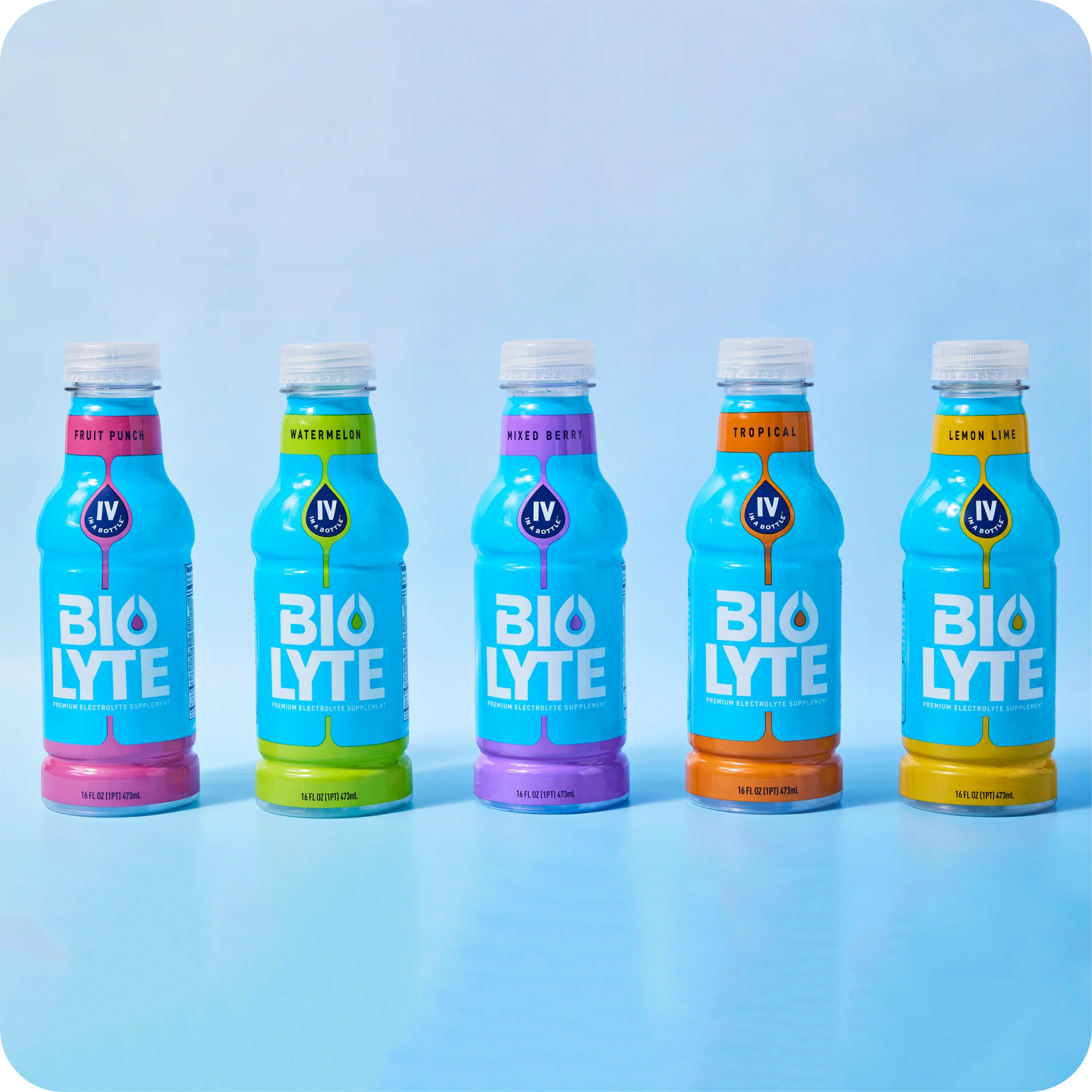
Fixed suppressed listings and recovered $80k/month
Feb 4, 2021
Expanded to Walmart with 40% of Amazon volume
Ready to Become a Case Study?
Let's talk about your Amazon challenges and how we can help you achieve results like these.


" transform="translate(0 0)" width="35.003699999999995px"/><path d="M 8 11.5 L 12 11.5 L 13 7.5 L 8 7.5 L 8 5.5 C 8 4.47 8 3.5 10 3.5 L 13 3.5 L 13 0 C 13 0 9.943 0 8.643 0 C 5.928 0 4 1.657 4 4.7 L 4 7.5 L 0 7.5 L 0 11.5 L 4 11.5 L 4 20 L 8 20 Z" fill="transparent" height="20.000010000000003px" id="BReLpuFzM" stroke-dasharray="" stroke-linecap="butt" stroke-linejoin="round" stroke-width="1.5" stroke="rgb(171, 199, 212)" transform="translate(10.501 7.501)" width="13px"/></g></svg>)

" transform="translate(0 0)" width="35px"/><path d="M 10.113 4.988 C 6.128 5.318 2.517 2.153 1.42 0.153 C 1.415 0.145 1.404 0.147 1.402 0.155 C 0.197 4.698 1.507 9.733 4.456 12.37 C 4.259 12.6 2.73 14.484 0.01 14.501 C 0 14.501 -0.004 14.515 0.005 14.52 C 7.505 18.848 18.004 13.133 18.004 4.388 L 19.989 0.515 C 19.993 0.508 19.987 0.5 19.978 0.501 L 16.641 1.015 C 12.535 -1.974 9.543 2.334 10.113 4.988 Z" fill="transparent" height="15.998323674928294px" id="OkQFhcSnI" stroke-dasharray="" stroke-linecap="butt" stroke-linejoin="round" stroke-width="1.5" stroke="rgb(171, 199, 212)" transform="translate(7.501 9.5)" width="19.990075856575178px"/></g></svg>)
" transform="translate(0 0)" width="35px"/><path d="M 4.5 0 L 0 0 L 0 12.499 L 4.5 12.499 Z" fill="transparent" height="12.49867871110765px" id="RIbzJL_pQ" stroke-dasharray="" stroke-linecap="butt" stroke-linejoin="round" stroke-width="1.5" stroke="rgb(171, 199, 212)" transform="translate(7.501 15)" width="4.499524335998755px"/><path d="M 4.5 2.25 C 4.5 3.492 3.493 4.5 2.25 4.5 C 1.007 4.5 0 3.492 0 2.25 C 0 1.007 1.007 0 2.25 0 C 3.493 0 4.5 1.007 4.5 2.25 Z" fill="transparent" height="4.499534334941724px" id="URceBkGHW" stroke-dasharray="" stroke-linecap="butt" stroke-linejoin="round" stroke-width="1.5" stroke="rgb(171, 199, 212)" transform="translate(7.501 7.501)" width="4.499524335998755px"/><path d="M 4.5 0 L 0 0 L 0 12.499 L 4.5 12.499 L 4.5 6.25 C 4.5 5.283 5.282 4.5 6.249 4.5 C 7.215 4.5 7.999 5.283 7.999 6.25 L 7.999 12.499 L 12.498 12.499 L 12.499 4.5 C 12.499 2.015 10.135 0 7.796 0 C 6.464 0 5.276 0.653 4.5 1.674 Z" fill="transparent" height="12.49867871110765px" id="MadyAM_6_" stroke-dasharray="" stroke-linecap="butt" stroke-linejoin="round" stroke-width="1.5" stroke="rgb(171, 199, 212)" transform="translate(15 15)" width="12.498678711107651px"/></g></svg>)
" transform="translate(0 0)" width="35px"/><path d="M 18.998 2 L 18.998 16.998 C 18.998 18.103 18.103 18.998 16.998 18.998 L 2 18.998 C 0.896 18.998 0 18.103 0 16.998 L 0 2 C 0 0.895 0.896 0 2 0 L 16.998 0 C 18.103 0 18.998 0.895 18.998 2 Z" fill="transparent" height="18.9980016398266px" id="GJb2jRpoX" stroke-dasharray="" stroke-linecap="round" stroke-linejoin="round" stroke-width="1.5" stroke="rgb(171, 199, 212)" transform="translate(8 8.001)" width="18.997991640883626px"/><path d="M 8.999 4.5 C 8.999 6.985 6.985 8.999 4.5 8.999 C 2.015 8.999 0 6.985 0 4.5 C 0 2.014 2.015 0 4.5 0 C 6.985 0 8.999 2.014 8.999 4.5 Z" fill="transparent" height="8.999048671997508px" id="VJaUN8aZ_" stroke-dasharray="" stroke-linecap="round" stroke-linejoin="miter" stroke-miterlimit="10" stroke-width="1.5" stroke="rgb(171, 199, 212)" transform="translate(13 13)" width="8.999048671997508px"/><path d="M 0.009 0 L 0 0" fill="transparent" height="1px" id="wzau5HB7B" stroke-dasharray="" stroke-linecap="round" stroke-linejoin="round" stroke-width="2" stroke="rgb(171, 199, 212)" transform="translate(22.997 12)" width="1px"/></g></svg>)
" transform="translate(0 0)" width="35px"/><path d="M 4.999 3 L 0 0 L 0 5.999 Z" fill="transparent" height="5.9993657813316705px" id="TRegc5Igj" stroke-dasharray="" stroke-linecap="butt" stroke-linejoin="round" stroke-width="1.5" stroke="rgb(171, 199, 212)" transform="translate(15.5 14.5)" width="4.99947148444306px"/><path d="M 16.849 0.441 C 14.759 0.158 12.441 0 9.999 0 C 7.556 0 5.237 0.158 3.148 0.441 C 1.295 0.692 0 2.328 0 4.198 L 0 11.8 C 0 13.67 1.295 15.306 3.148 15.557 C 5.237 15.841 7.556 15.998 9.999 15.998 C 12.441 15.998 14.759 15.841 16.849 15.557 C 18.703 15.306 19.998 13.67 19.998 11.8 L 19.998 4.198 C 19.998 2.328 18.703 0.692 16.849 0.441 Z" fill="transparent" height="15.998318749160763px" id="AZUAgbjVH" stroke-dasharray="" stroke-linecap="butt" stroke-linejoin="round" stroke-width="1.5" stroke="rgb(171, 199, 212)" transform="translate(7.501 9.5)" width="19.997885937772242px"/></g></svg>)